

DiagnostiCare Onlus – Institutional Website Redesign
DiagnostiCare Onlus is a non-profit medical organization based in Rome, offering free or donation-based healthcare services to people in need. The goal of the redesign was to create a clean, accessible, and empathetic website that clearly communicates the organization’s mission, projects, and services while making it easier for users to find information and support the cause.
Tools
Figma, Adobe Photoshop
Role
UI Design / UX Design / Accessibility Design
Year
2025
The Ask
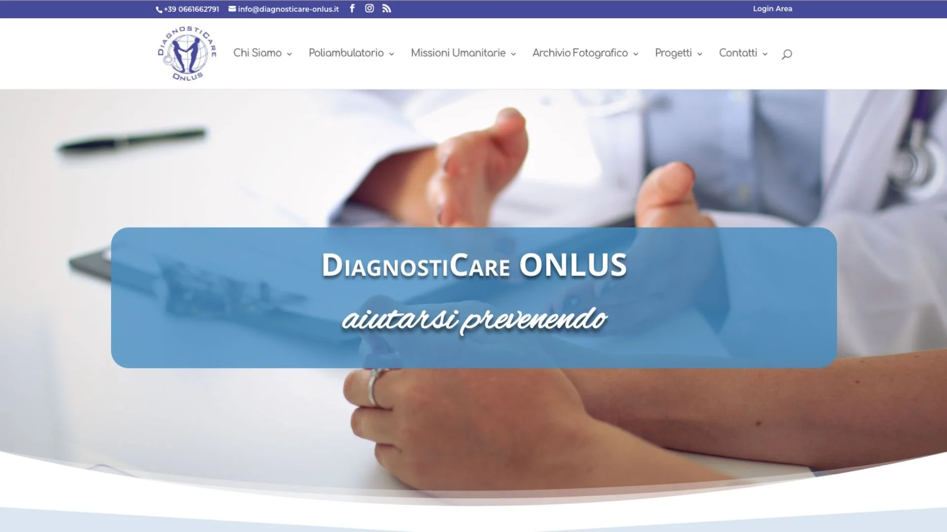
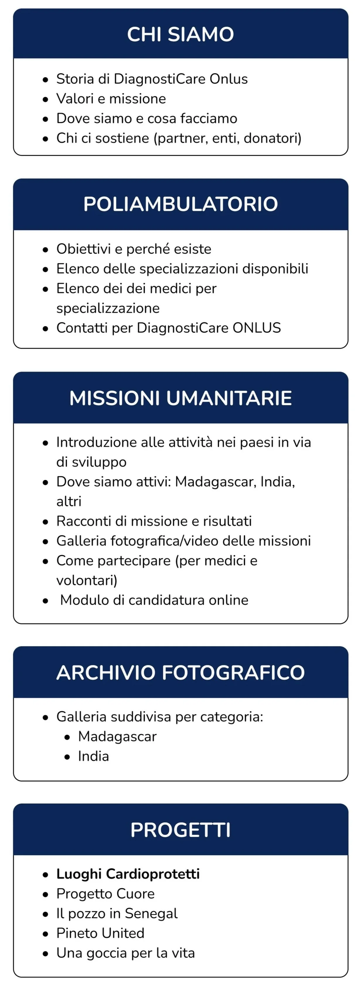
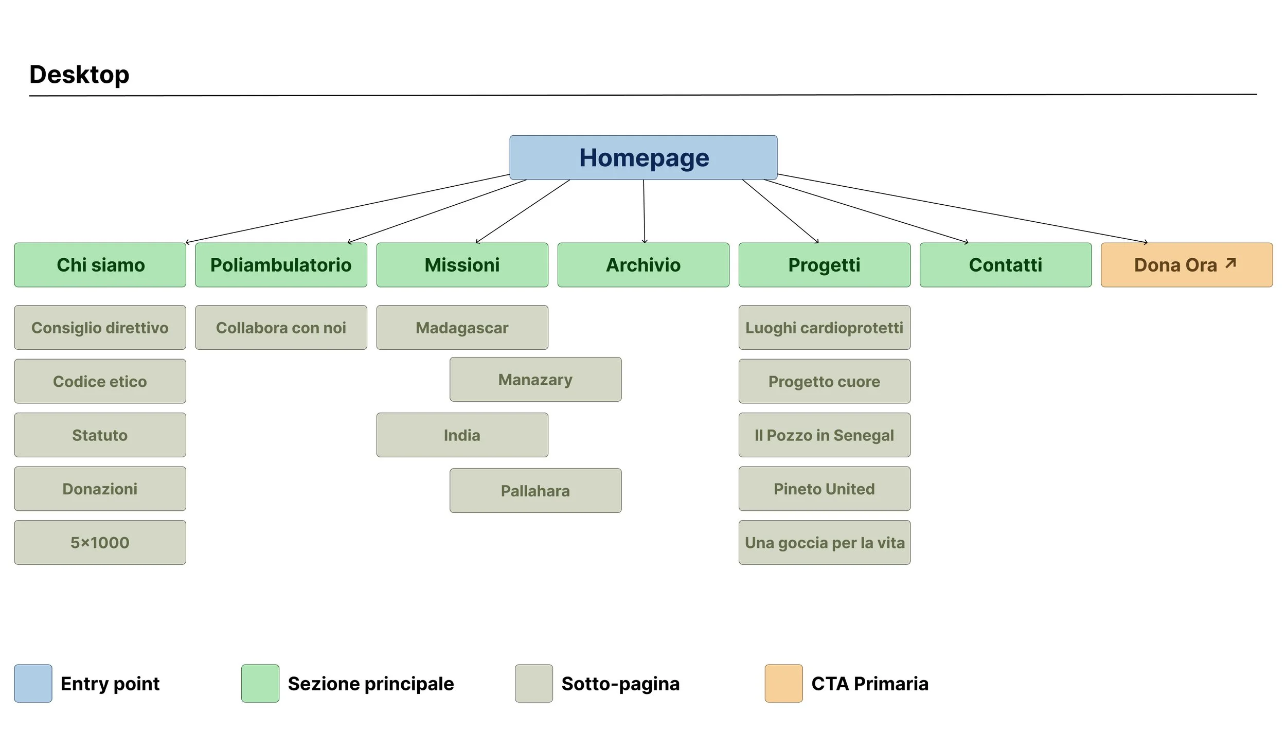
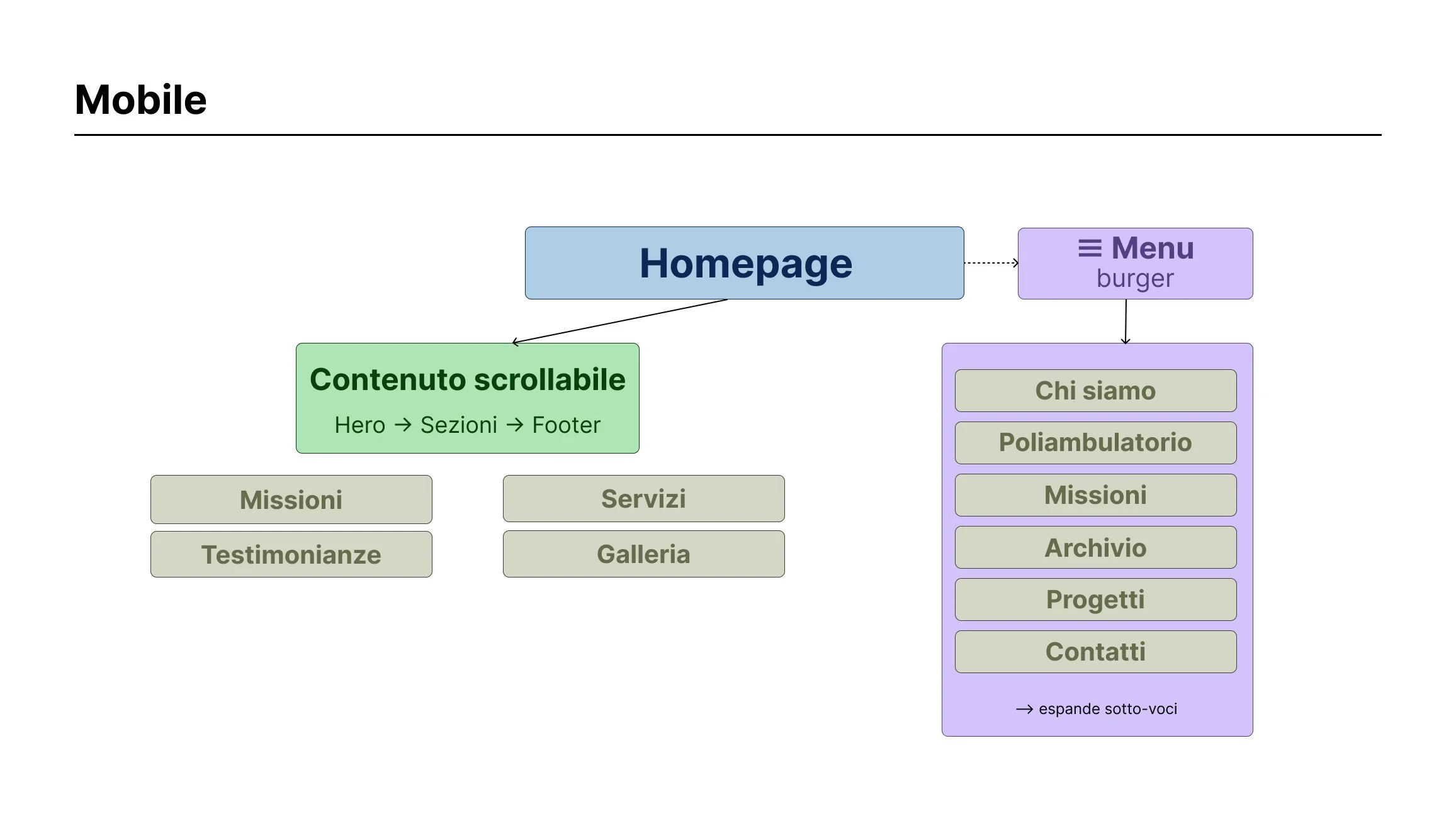
The old DiagnostiCare website had a fragmented information architecture with multiple nested navigation levels, no clear path to donate, and limited mobile responsiveness. Visitors struggled to understand the organization's mission at a glance, and key sections — like the Poliambulatorio and humanitarian missions — were buried under unclear labels. The goal was to rebuild the site's structure from the ground up: simplifying navigation, creating a visible donation flow, and designing an interface accessible to users of all ages and digital literacy levels.
The Solution
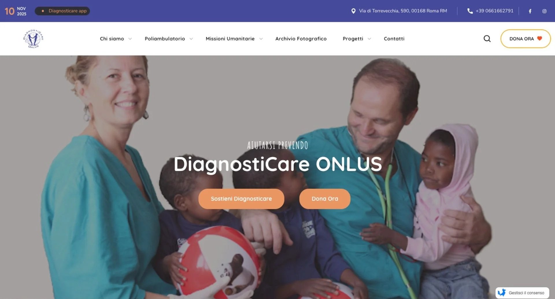
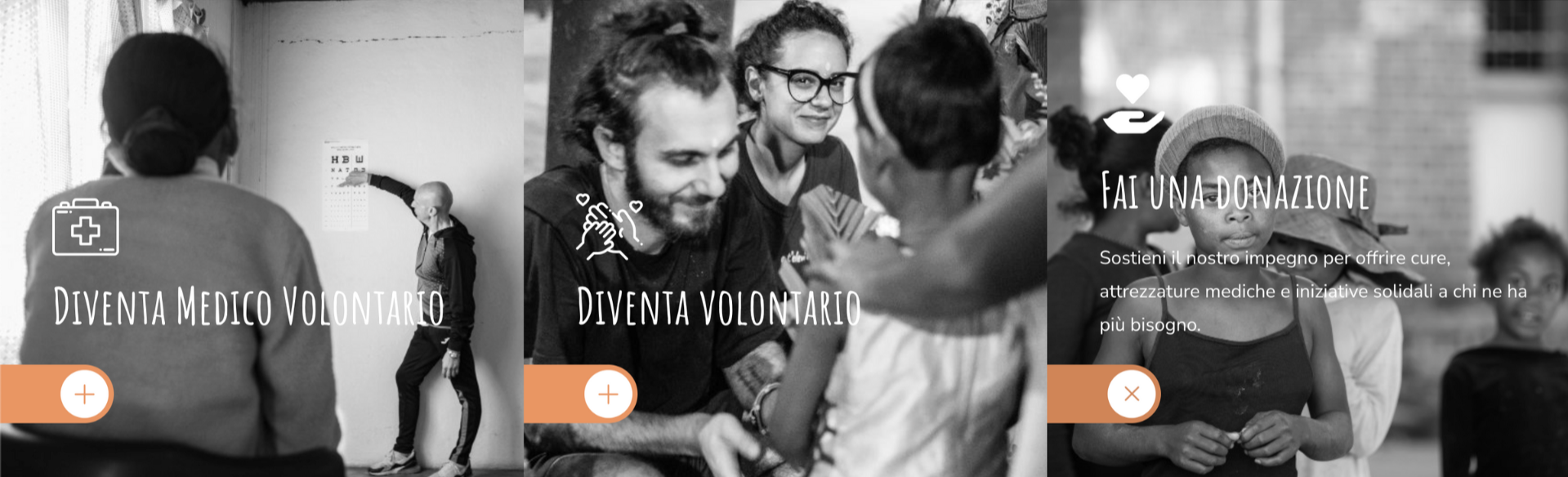
I reorganized the site’s information architecture, simplifying navigation and introducing a visual hierarchy that makes key sections — Who We Are, Poliambulatorio, Projects, Missions, and Donate Now — easy to access. The new design uses neutral colors, warm imagery, and a calm typographic rhythm to reflect trust, transparency, and human connection.
The Balance Between Emotion and Function
The main challenge was balancing emotional communication with functional clarity. The site needed to express warmth and empathy without losing readability or accessibility, especially for users unfamiliar with digital interfaces.
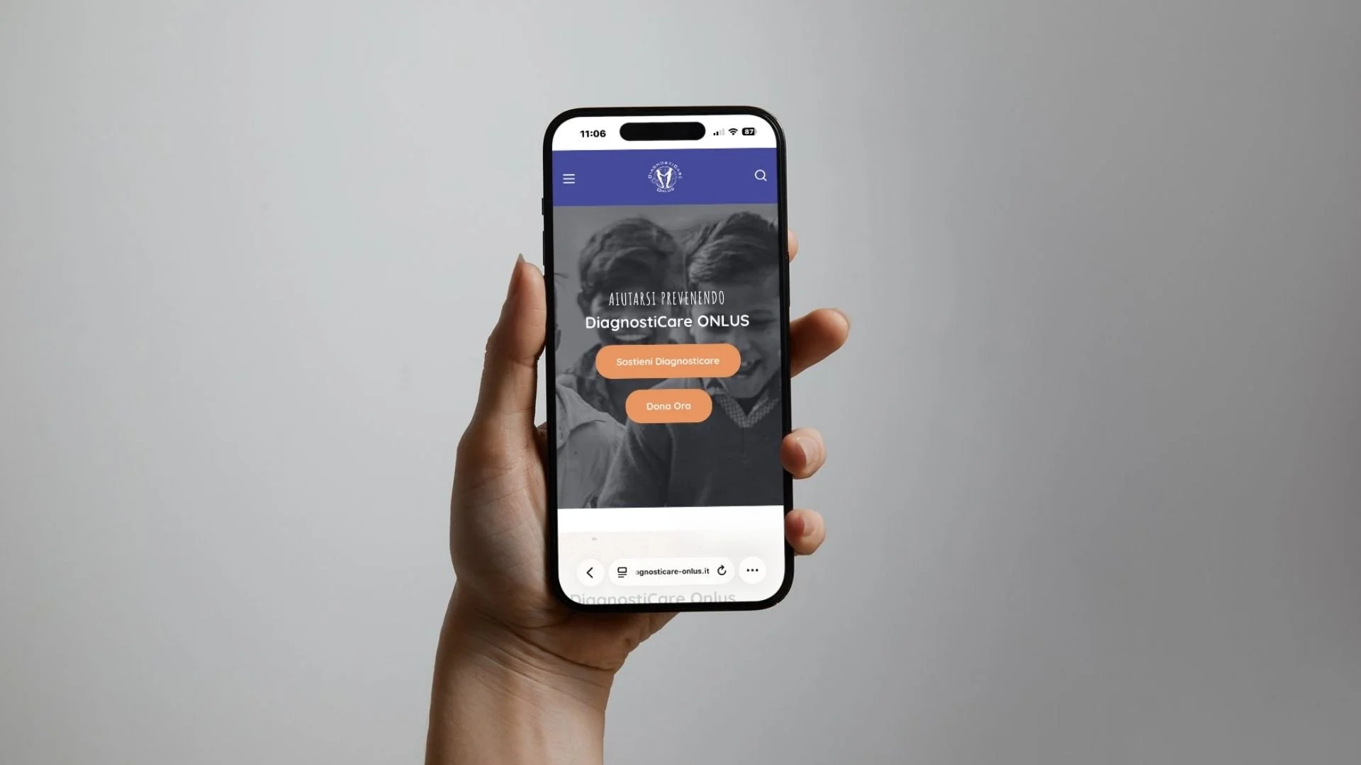
Old Website
New Website
Designing the Ride
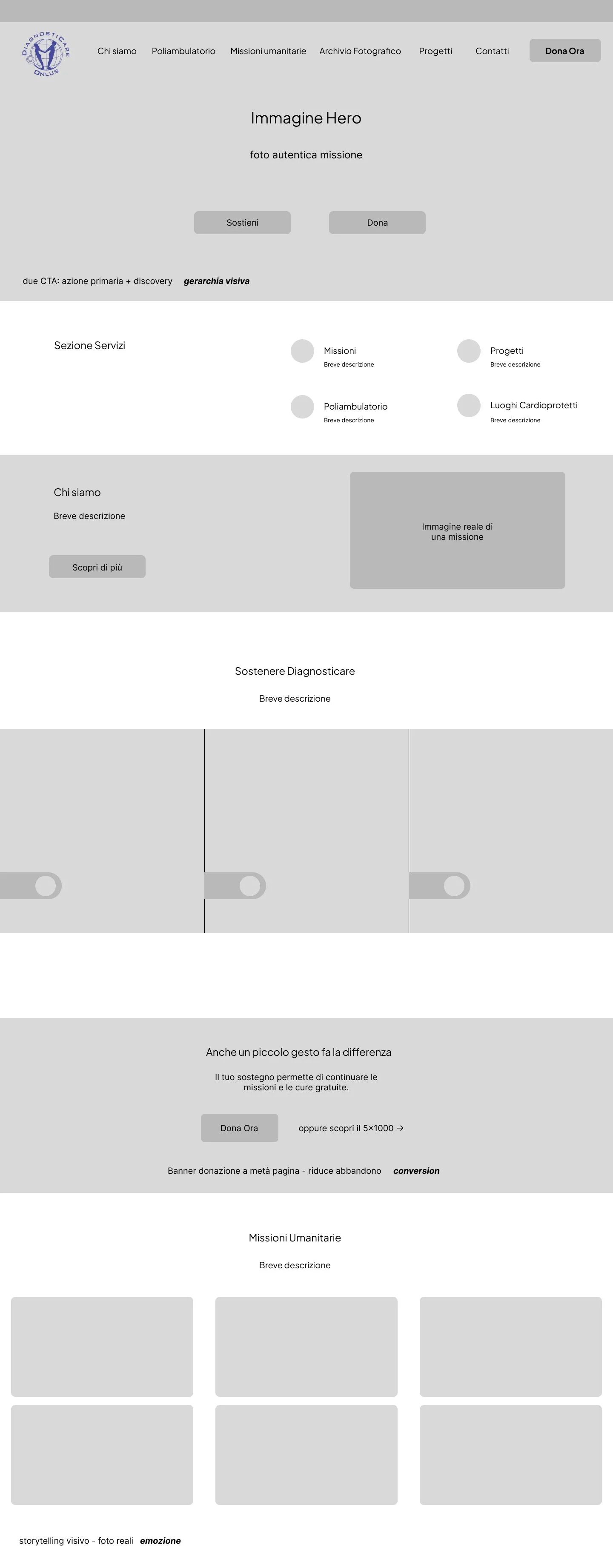
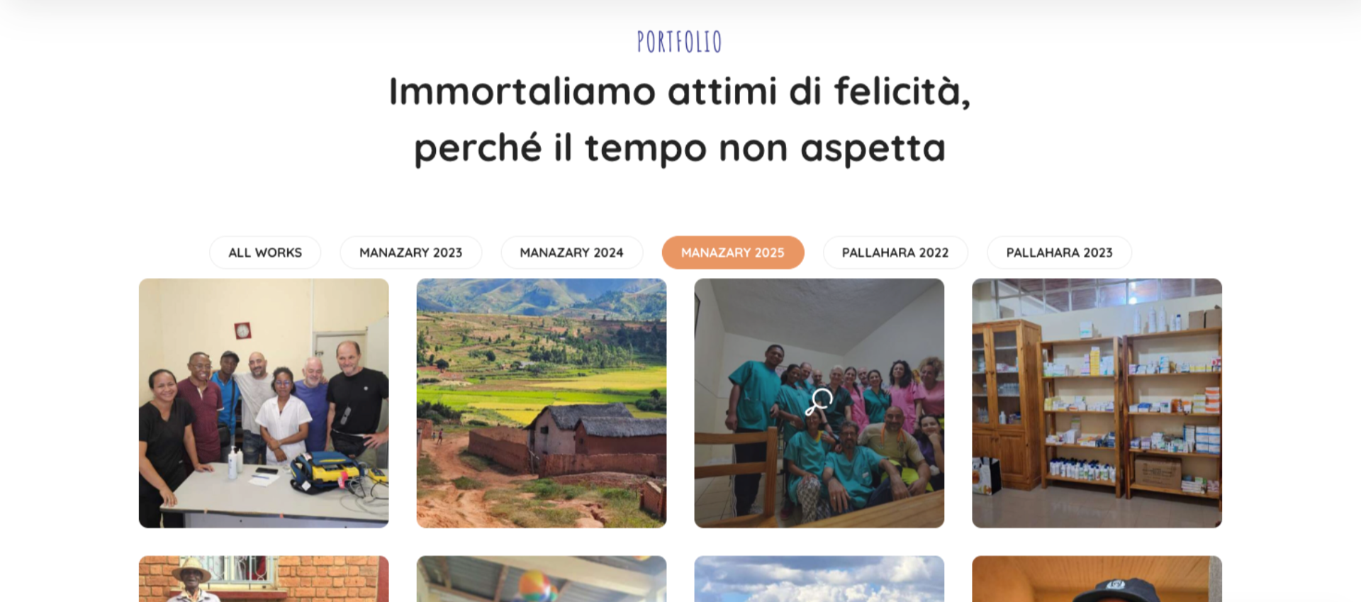
The process began with a review of the old site’s structure to identify usability and content hierarchy issues. I created wireframes to reorganize information and tested different visual tones to achieve a friendly yet professional feel. The final layout uses wide white spaces and clean navigation paths to ensure a peaceful browsing experience.
Visual Direction
The new visual identity is built around a calm and balanced palette, combining deep blue-violet, light blue, and soft sky tones. To add warmth and contrast, I introduced a muted orange accent, bringing a more human and emotional touch to the interface.
The design is complemented by warm, authentic photography that communicates care and inclusion. Typography blends Nunito Sans and Quicksand for a friendly, readable, and modern visual rhythm, perfectly aligned with the organization’s empathetic mission.
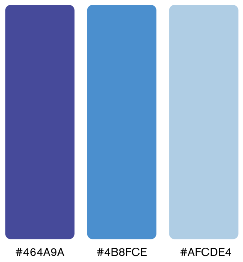
Primary Colors

Secondary Color


Design System in Action
I developed a consistent set of UI components — buttons, cards, forms, and section layouts — ensuring coherence across all pages. Accessibility was a key focus: high contrast ratios, readable font sizes, and clear visual feedback for every interaction.
Default and active button states

Results & Reflections
The redesigned DiagnostiCare Onlus website is currently live at diagnosticare-onlus.it. The new information architecture simplified the navigation structure by consolidating overlapping sections and reducing the number of top-level menu items. The client validated the redesign after two rounds of feedback, appreciating the cleaner structure and the warmer visual tone.
Through this project I learned how to balance emotional storytelling with functional clarity, ensuring that empathy and usability reinforce each other rather than compete.
I also strengthened my workflow from content audit to development handoff, managing a content-heavy site while keeping the design system consistent across all pages.
Most importantly, this project confirmed that good design can directly amplify social impact: a clearer, more accessible interface helps an organization like DiagnostiCare reach more people and inspire more support.
