BICYCLE ROMA – Riding towards a smoother digital experience
Bicycle Roma is a bike rental and sales company based in Rome. The redesign project focused on giving the website a more dynamic, accessible, and mobile-friendly interface.
The goal was to make the browsing and booking experience faster, simpler, and more engaging, reflecting the brand’s passion for movement and sustainability.
Tools
Figma, Adobe Photoshop,
Wordpress, Elementor
Role
UI Design / UX Flow / Visual Direction
Year
2025
The Ask
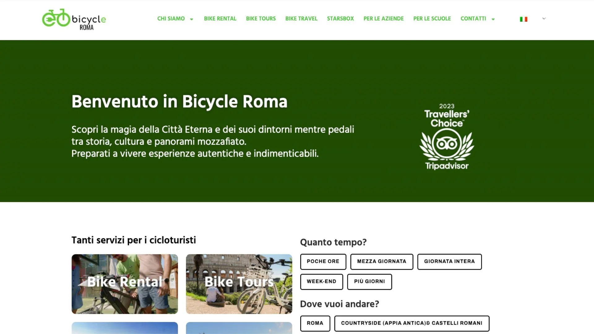
The old Bicycle Roma website had no clear visual hierarchy, poor mobile responsiveness, and a navigation structure that made it difficult for users to find and book the right experience. With a growing catalogue of tours, rentals, and multi-day trips, the site needed a complete redesign — one that would make browsing faster and more intuitive, reflect the brand's energetic personality, and convert visitors into bookings, especially on mobile.
The Solution
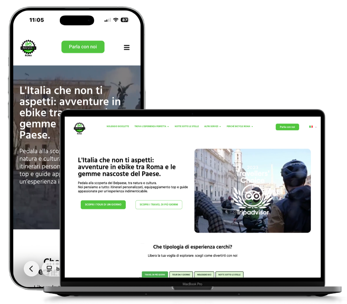
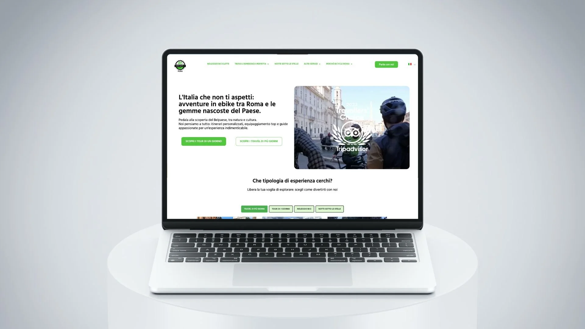
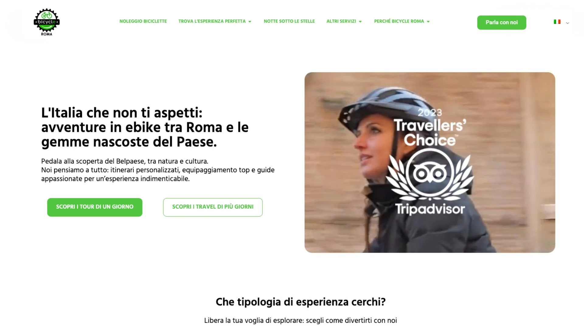
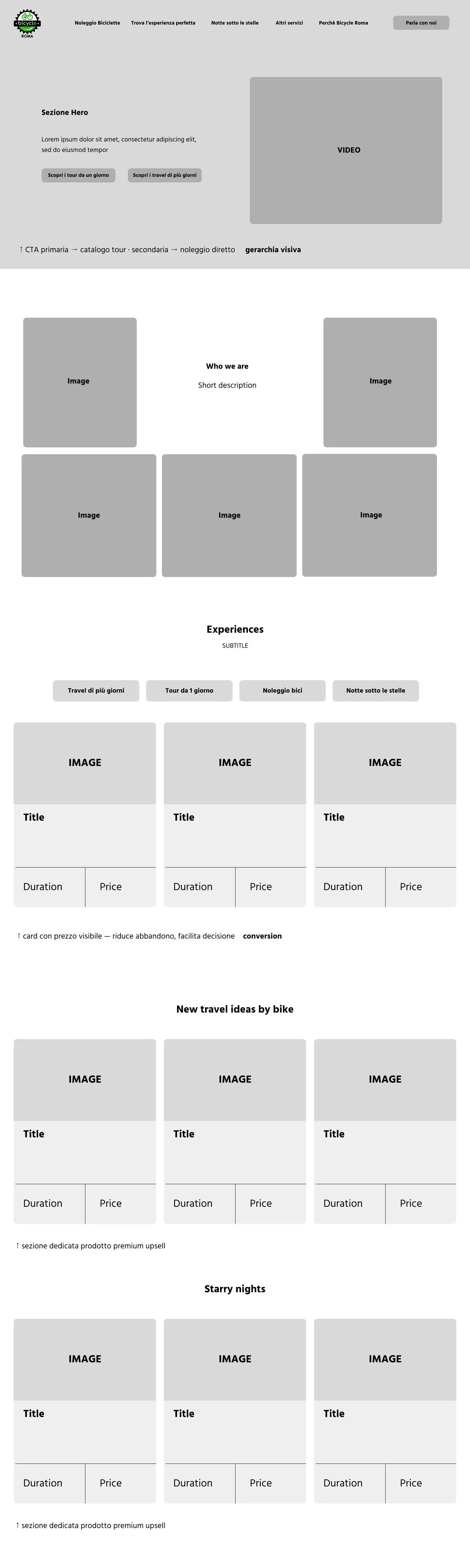
I simplified the information structure and created a clean, mobile-first layout that highlights key services like rental, sales, and assistance. The new design uses dynamic visuals and clear CTAs to guide users through the experience.
The Challenge
The previous website lacked visual hierarchy and responsiveness. My challenge was to reorganize the content and design a modern interface that enhances usability while keeping the brand’s energetic and approachable spirit.
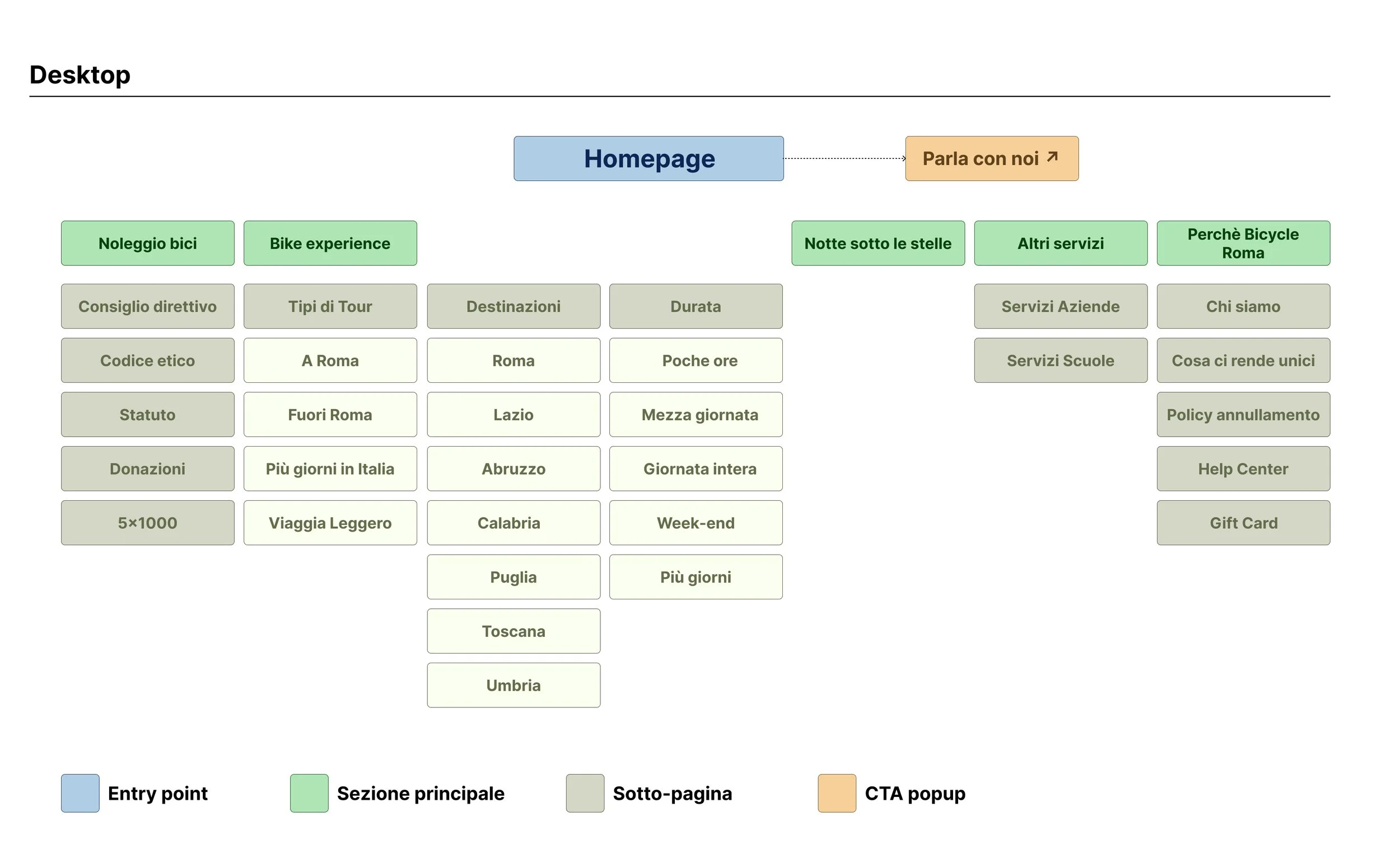
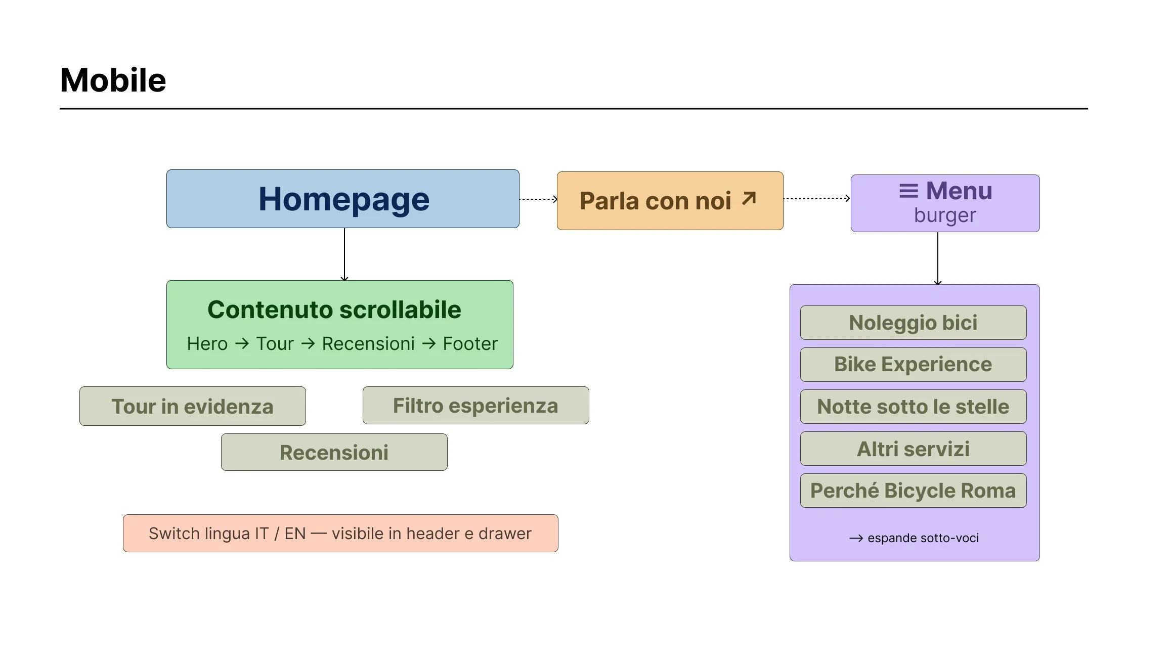
I started by analyzing the existing layout to identify usability issues and redundant sections.
From there, I developed new wireframes focused on mobile-first navigation, then translated them into high-fidelity mockups with a clean, modular design and consistent visual rhythm.
Old Website
New Website
Design Process - From Concept to Interface
I started with a content audit of the existing site, identifying redundant sections, unclear CTAs, and layout inconsistencies across breakpoints. From there I mapped the user journey, from landing on the homepage to completing a booking, and used that flow to inform the new information architecture. I developed low-fidelity wireframes focused on mobile-first navigation, then translated them into high-fidelity mockups with a clean, modular layout and consistent visual rhythm
Visual Identity - Shaping the Identity
The new visual language reflects Bicycle Roma’s personality — friendly, dynamic, and trustworthy.
The bright color palette and clean typography (Hind + DM Sans) evoke energy and movement, while rounded shapes and wide spacing ensure readability and flow.

Primary Colors

Secondary Color


Design System in Action
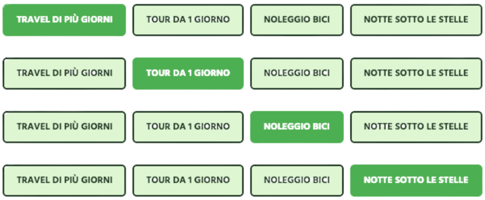
I created a small design system to maintain visual consistency across pages — including buttons, forms, cards, and navigation bars.
Each element adapts seamlessly to mobile view, ensuring a cohesive experience for every user.
Card Hover
Normal Card

Default and active button states
Results & Reflections
The redesigned Bicycle Roma website is currently live at bicycleroma.com. The new mobile-first layout makes the booking experience significantly faster across devices, with clearer CTAs and a streamlined tour catalogue that helps users find the right experience in fewer steps. The client validated the redesign appreciating the more dynamic visual tone and the improved structure of the services section.
This project strengthened my approach to responsive design and taught me how to translate a brand's physical energy, movement, freedom and adventure, into a coherent digital language. It also reinforced the importance of designing for conversion, not just aesthetics: every layout decision was guided by the question of whether it helped the user take the next step.