INTO THE NET - Website & Brand Redesign
A complete redesign of Into The Net’s website and visual identity.
The goal was to modernize the brand and create a clean, cohesive digital presence that reflects the company’s expertise in software and web solutions.
Tools
Figma, Adobe Photoshop,
Adobe Illustrator
Role
Visual Designer & Art Director
Year
2025
The Ask
Refresh the company’s digital identity through a complete redesign of the website and logo, creating a more modern and cohesive brand presence across all platforms.
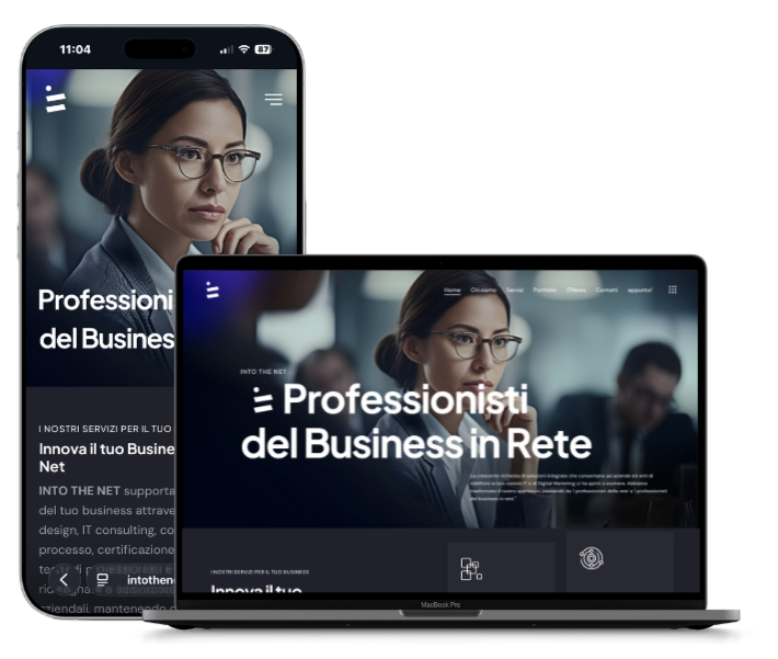
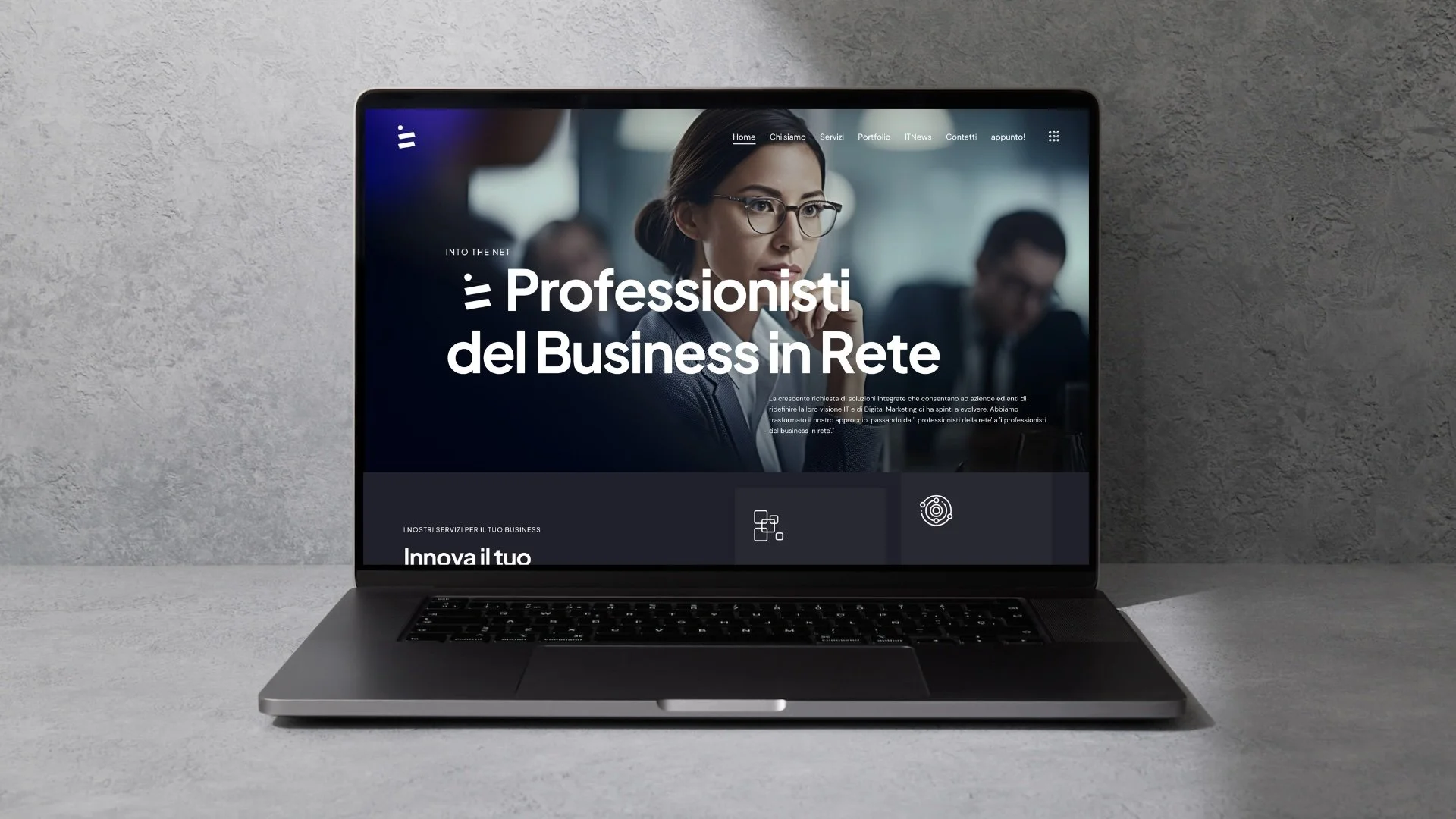
The Solution
I redesigned the website with a modular grid and a lighter visual style, defining a new color palette and typography system. The result is a clean, professional interface that reflects the company’s innovation and reliability.
Objectives - What We Aimed For
The project aimed to strengthen the company’s online image, simplify navigation, and make the communication more consistent with
Into The Net’s technical and creative profile.
Modern brand identity
Improved user experience
Modular web layout
Design Process - From Concept to Interface
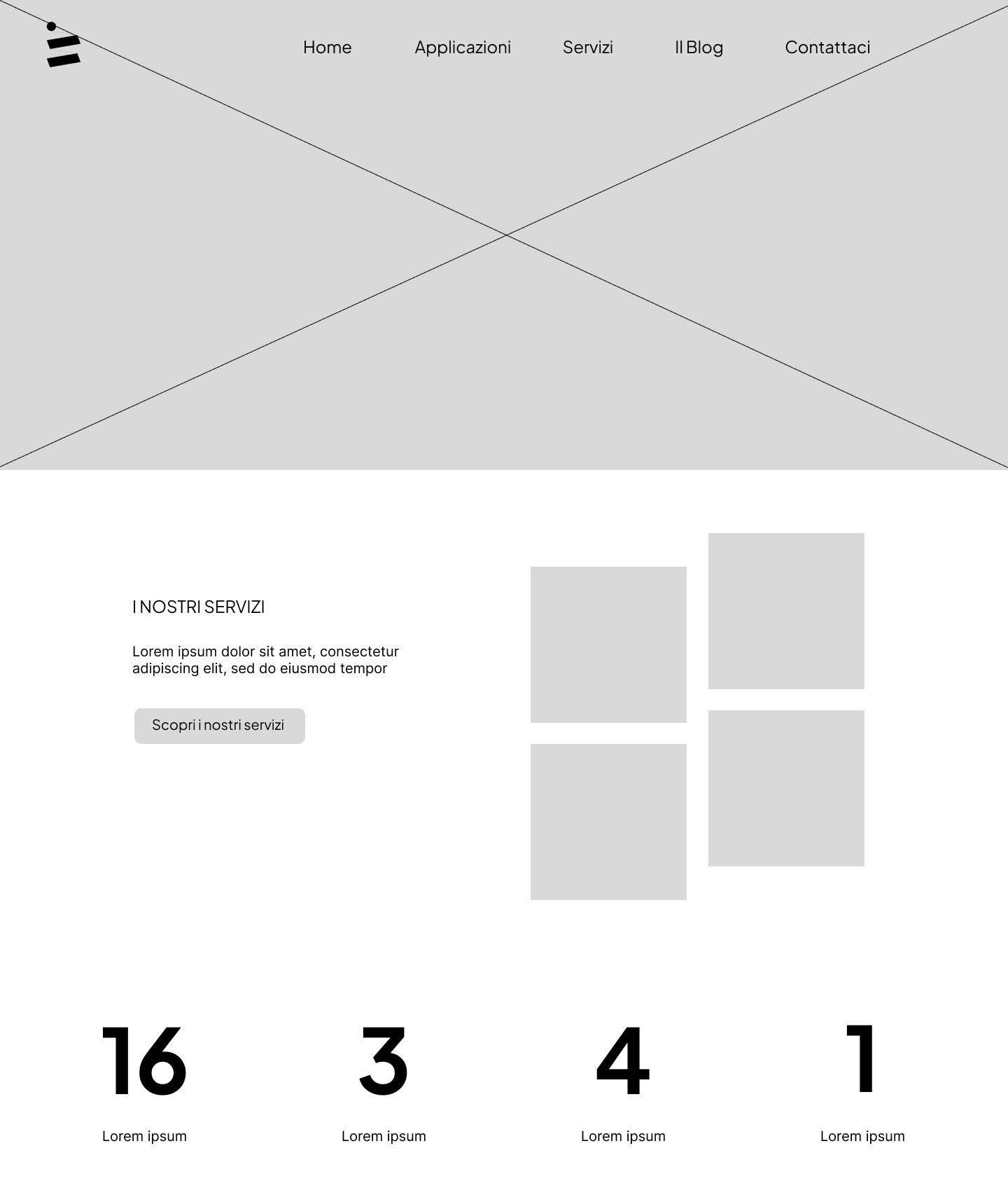
I started by analyzing the existing website to identify usability issues and inconsistencies in visual language. Based on this, I redefined the color palette, typography, and layout grid to create a more balanced, modern interface.
Visual Identity - Shaping the Identity
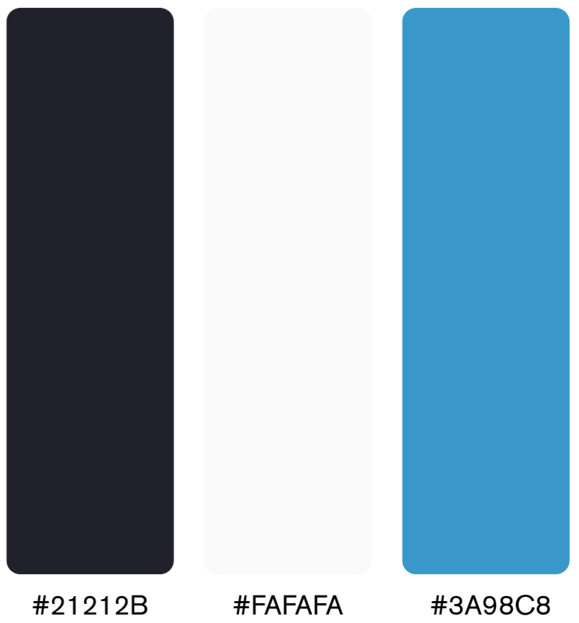
The redesign included a refreshed logo with simplified geometry and a more versatile color palette. The combination of Plus Jakarta Sans and DM Sans ensured clarity, balance, and visual harmony across all digital materials
Primary colors

Secondary colors
Old Version
Redesigned Version
The logo symbolizes a sphere uniting two dimensions:
the digital world above the physical, and intuition transformed into a new reality through method
and technology.


UI Components - Consistent Details
I designed consistent UI elements, including buttons, cards, and navigation components, ensuring coherence across different sections of the site.
Card Hover
Normal Card

Button Hover
Normal Button

Results & Reflections
This project was a valuable opportunity to strengthen both my visual and structural design skills.
Working on the redesign of Into The Net’s website and brand identity taught me how to balance creativity with usability — finding the right intersection between aesthetic impact and user needs.
Through this experience, I learned how to build and maintain a consistent design system, defining clear visual rules that can scale across multiple digital products.
It also improved my collaboration process with developers and other team members, especially in the handoff phase, where precision and communication are essential.
Finally, this project helped me become more confident in making design decisions based on reasoning, not trends — ensuring that every visual choice has a functional purpose and contributes to a cohesive user experience.