

REBRANDING ROSSANA
Rebranded the Italian candy Rossana, revitalizing its image for market visibility and create a fresh appeal.
Tools
Figma, Procreate, Adobe Illustrator,
Adobe Photoshop
CD/AD
Diego Marini
Role
Visual designer, Brand strategist, Art director
The Ask
Revamp the Italian candy Rossana, providing it with a fresh start. This involves analyzing and updating its current outdated elements, ultimately giving the brand a renewed and modern identity.
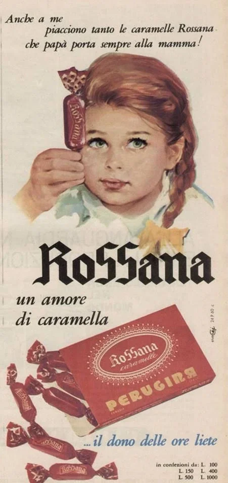
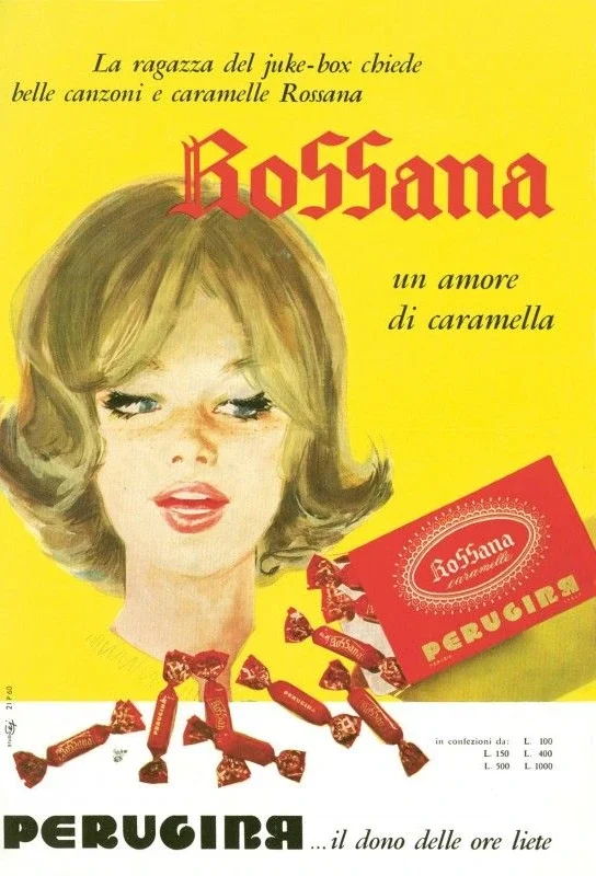
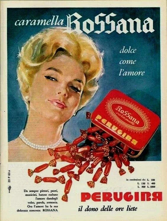
Rossana since 1926
Revamping the Italian candy Rossana
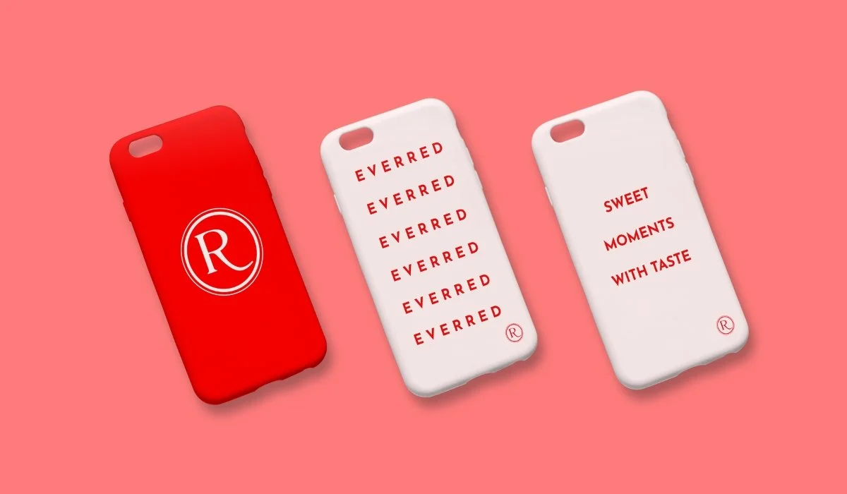
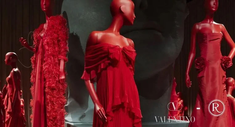
Revitalize the logo and typography to enhance brand impact, emphasize the significance of the red color to reinforce brand recognition, develop new, enticing merchandise to attract a wider audience in order to rejuvenate the essence of Rossana and strengthen its market presence.


Research and Strategy
The 4 values that best describe the rebranding of Rossana
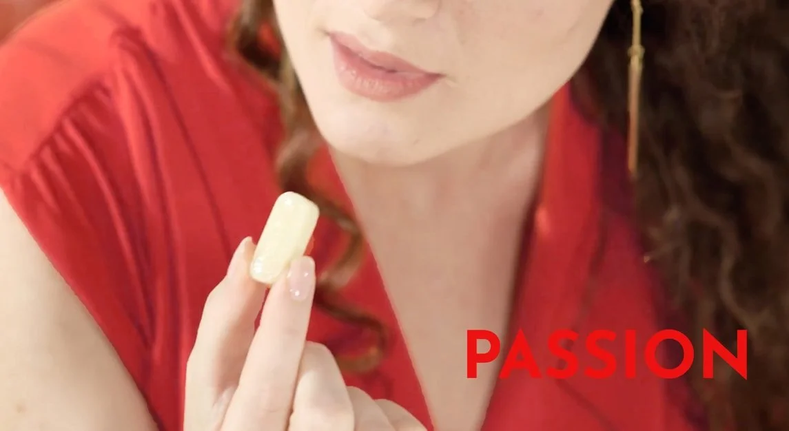
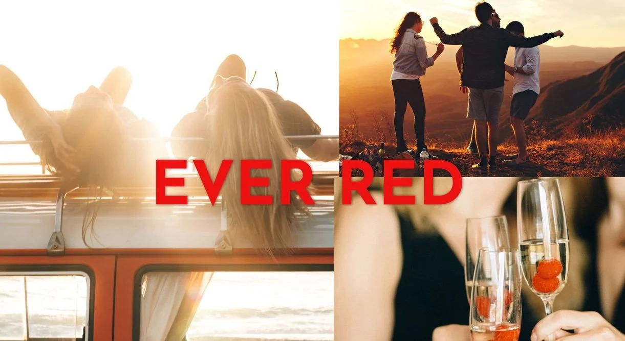
Passion for creating the best possible product and ensuring that customers enjoy every bite, anywhere and everywhere.
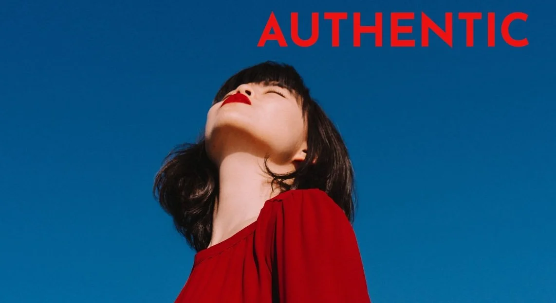
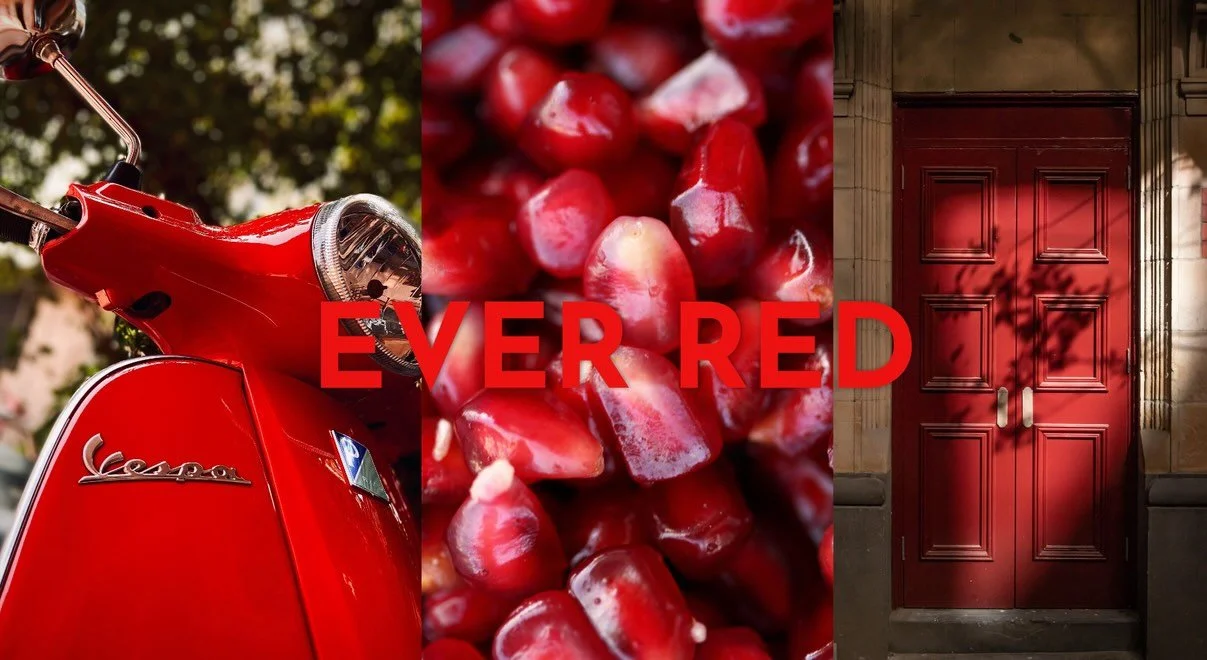
The brand prides itself on using only high-quality, natural ingredients, to create a delicious and authentic taste.
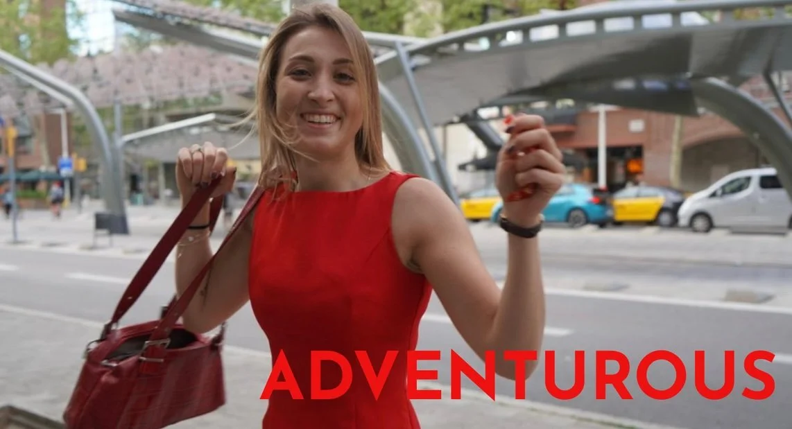
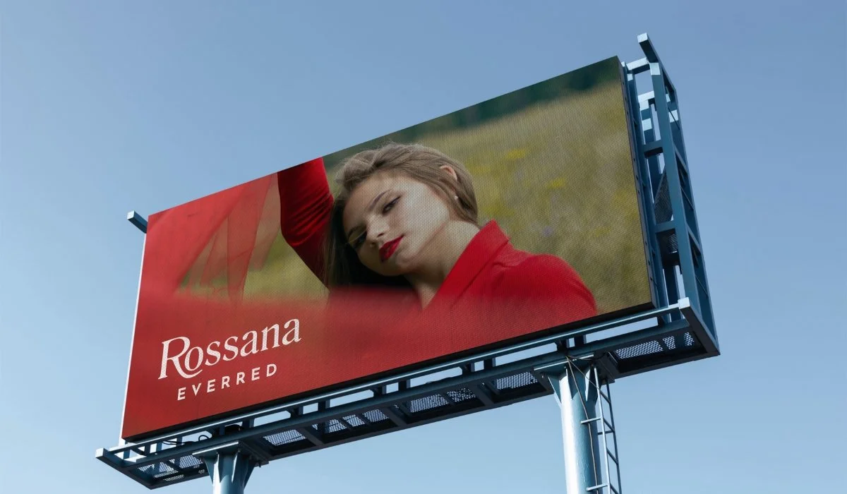
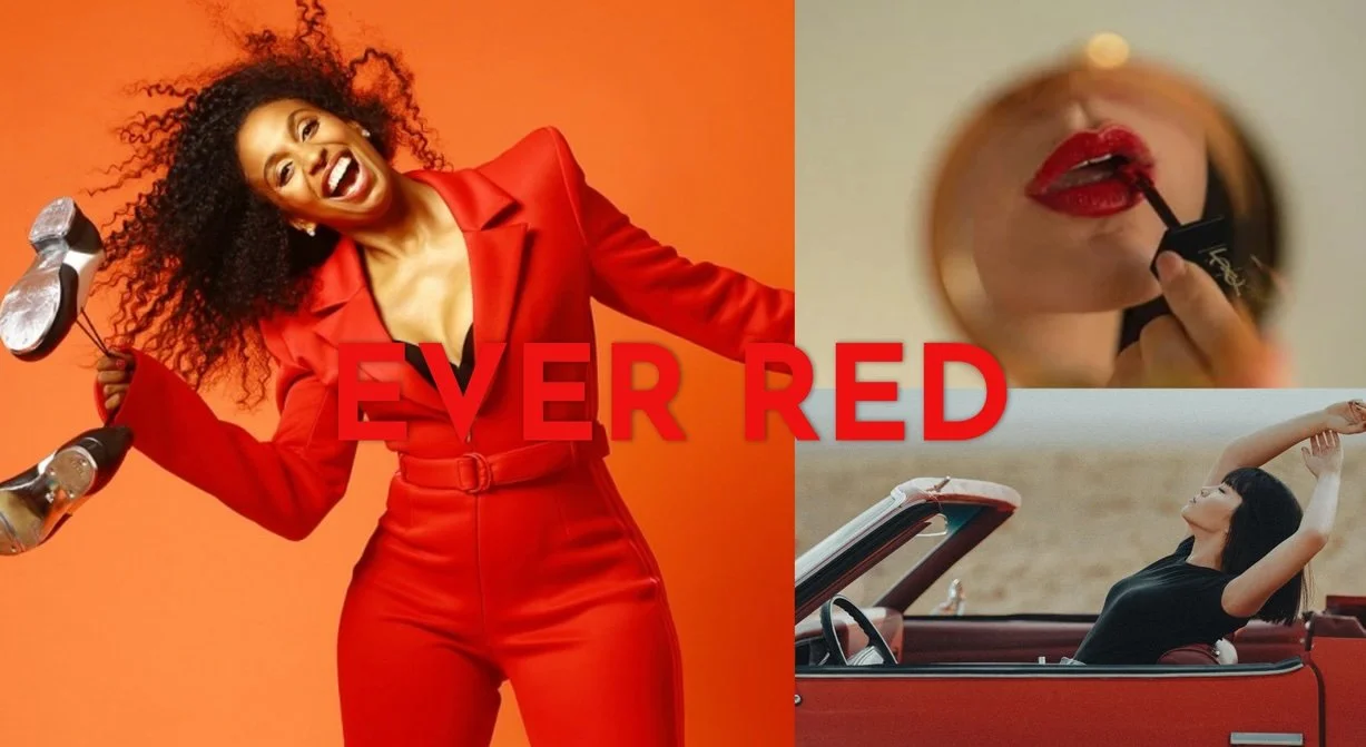
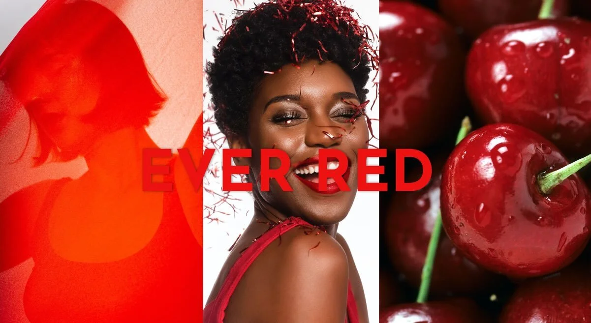
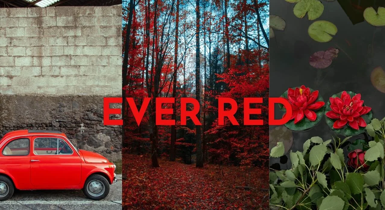
Rossana's commitment to adventure extends beyond just flavor, with the brand's packaging featuring the red colour that reflects the brand's adventurous spirit.
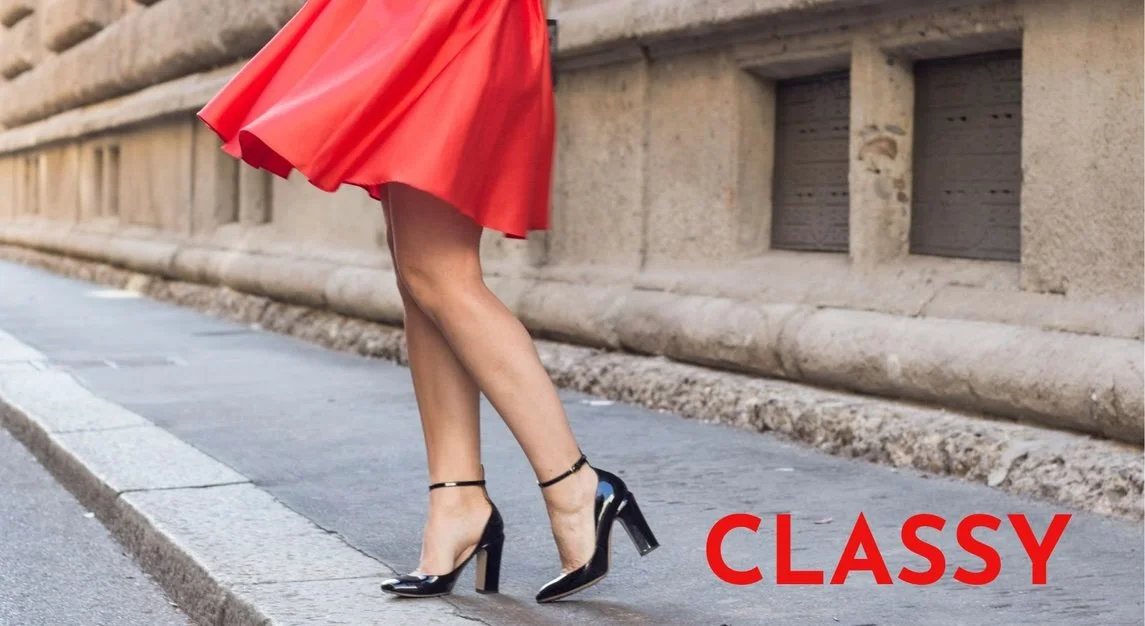
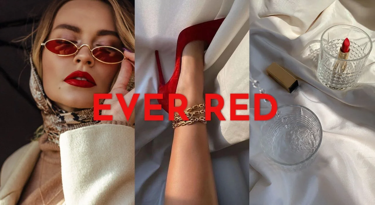
Rossana candies are a classy and refined product that delivers on taste, texture, and quality, making them a top choice for whoever appreciates a touch of elegance.
Elevating Rossana's Excellence
Brand awareness: many customers are still loyal to the brand, compared to most of the younger generation who doesn’t know the product.
Product range: add a new exterior packaging to appeal the wider audience (creating visually stunning packaging designs, featuring catchy slogans.)
I came out with 6 different objectives to understand the problems and solutions in the rebranding process.
Products
Target new demographics with the addition of new products and flavours.
Make a more appealing exterior packaging.
Packaging
Social
Engage more with different platforms such as Instagram and TikTok (most used).
Collaborations
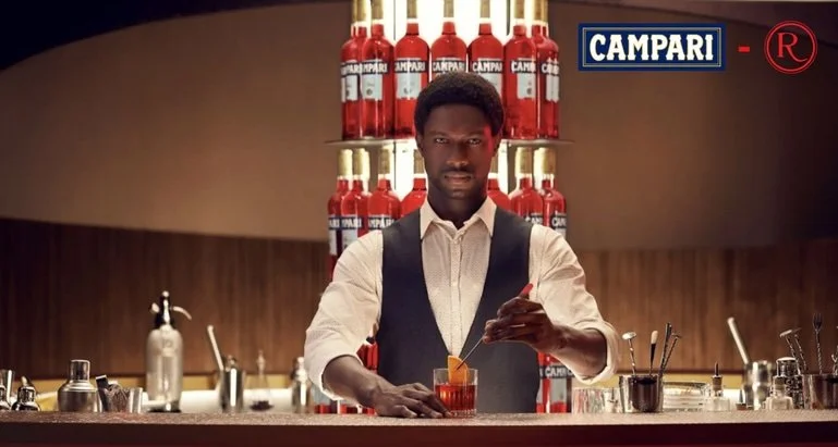
Collaborate with influencers and well-known brands.
Events
Host events about candy tasting to sponsor Rossana.
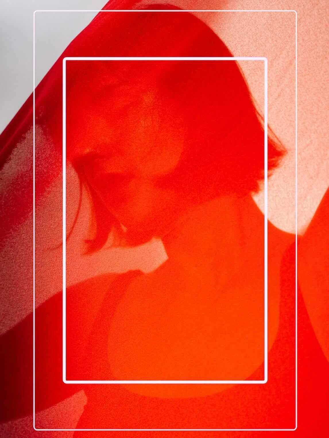
Who is Rossana?
Create a character that brings to life the candy (“Lady in Red”).
Mission
The mission was crafted with a simple goal in mind: to grasp why we're dedicated to bringing the joy of Rossana candy to people.
It centers on cherishing the delightful moments that fill our lives with happiness.

Vision
We strive to become the ideal and delicious treat during a break from the day or to share with friends and families.
Our candies symbolize high-quality, passion and elegance with a touch of adventurous spirit that will bring joy to people’s daily lives.
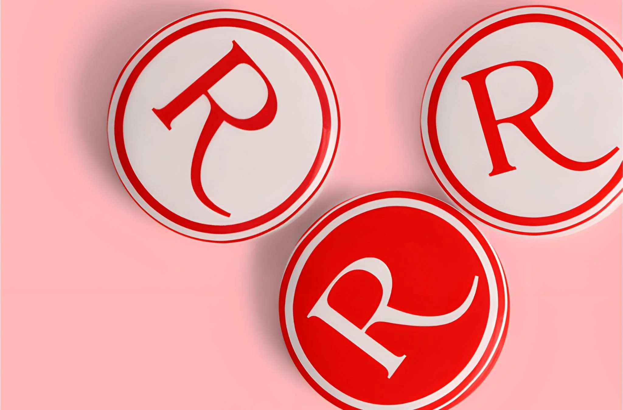
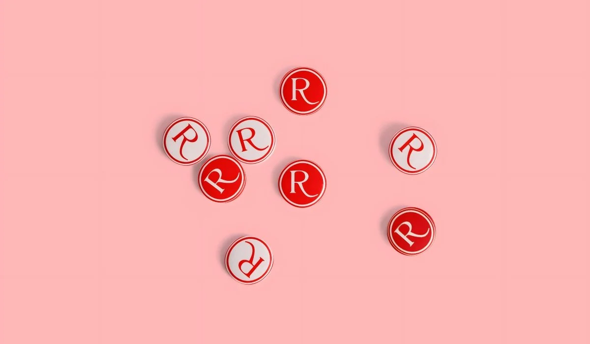
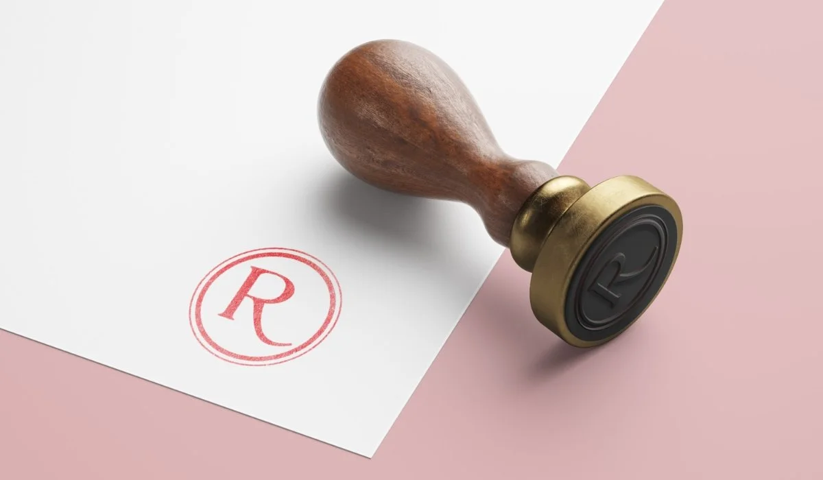
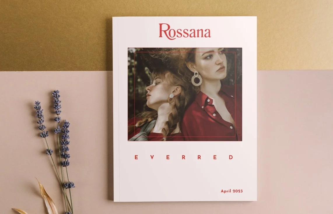
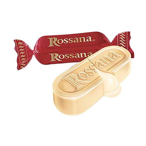
Logo
The logo has been improved by making it more contemporary with the Romana font. The gold colour was discarded to give space to the flaming Red. The leg of the "R" has been reshaped to make it more dynamic.


Typography


Colour Palette
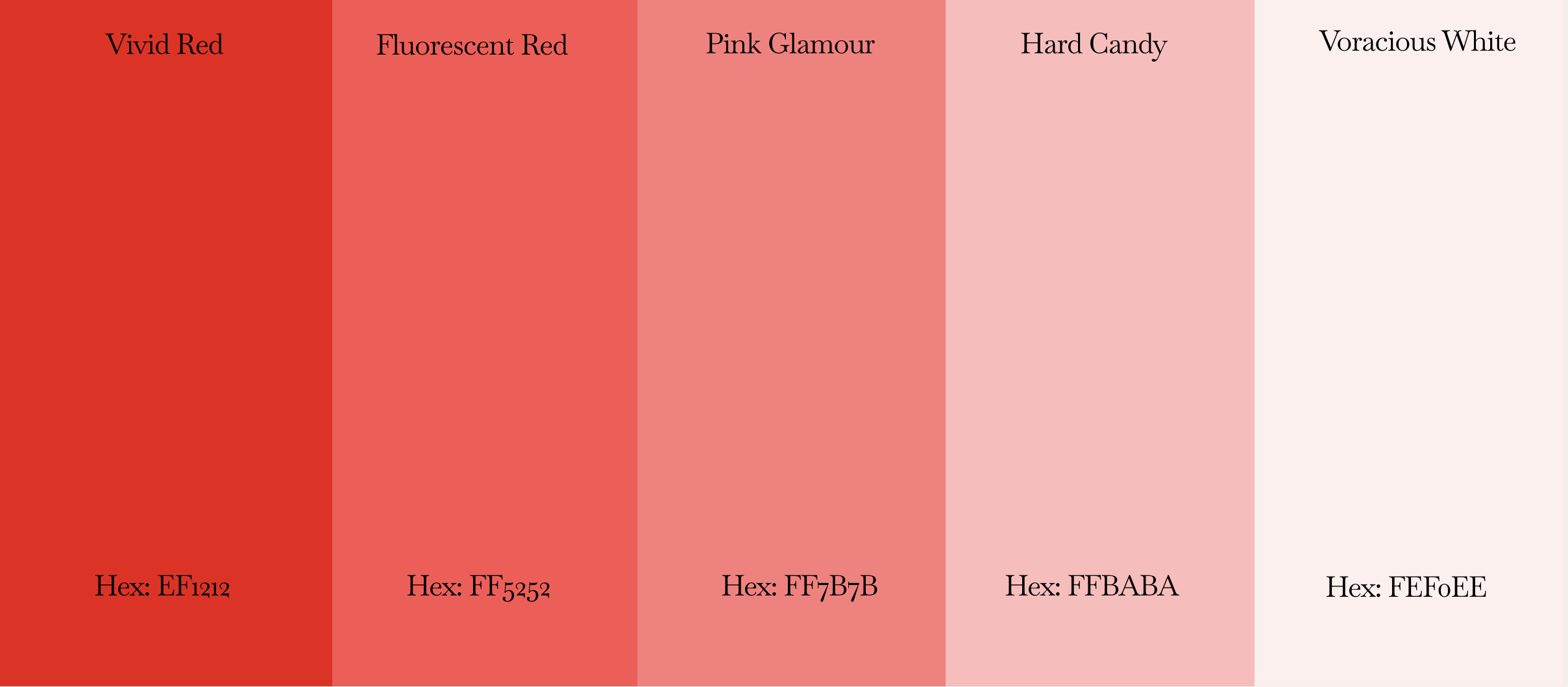
Secondary Colours
Primary Colour
Product Specific Colours

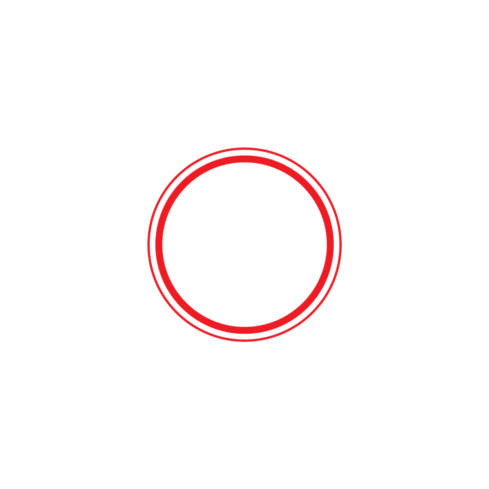
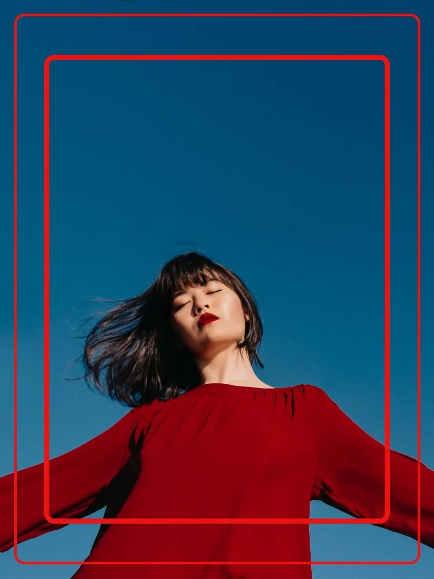
The Rossana candy has a shape formed by two rounded rectangles. A bigger one on the exterior that encapsulate the candy and a smaller one on the interior that outlines the core of the candy. The idea for the creative element comes from taking these two squares and adding them over photos, videos or quotes that represent the brand.
Creative Element

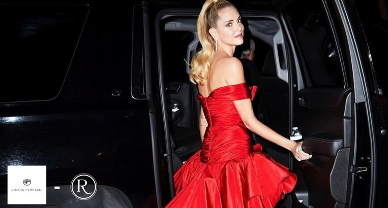
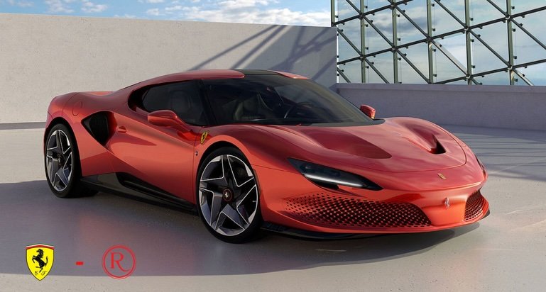
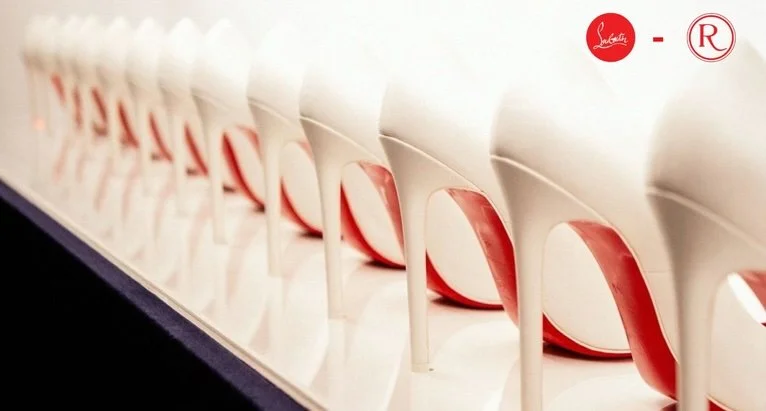
Collaborations
Collaborations with influencers and famous brands will be made to increase the visibility of Rossana.
What I've learned
I enojoyed giving Rossana a fresh new start! I realized that the red colour is the most important element to describe the Rossana brand to its fullest. So this is why I decided to implement it in every single aspect of the rebranding. Analyzing the brand I realized that Rossana has some issues that can be fixed through rebranding. I also grasped the importance of connecting branding with both the product and the audience by creating visually appealing gadgets.